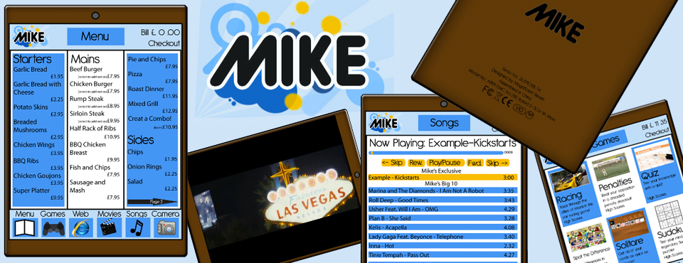
For our Mobile Media Project we were asked to “create a prototype of a mobile, portable or integrate device” including “a visual prototype of the device and an interface design of an application running on the device.”
Out of the three main ideas we came up with, including a Sky Player and a Portable Projector, we decided our best idea was “M.I.K.E.”, an interactive menu for restaurants. We researched into interactive menus and found there was a lot of interactive menus around already, but none of them were portable or mobile and were always fixed to the table. This gave our device a unique selling point, so we carried on with the development of our idea.
Our design for the device was very similar to an iPad but we wanted to include a front facing camera to the device to take pictures whilst in the restaurant. We designed a great looking product with a very appealing interface that included entertainment services as well as a menu. Songs, Movies, Games and the Web were added to the Camera applications to make the menu more than a menu, but more an entertainment system, hence why “M.I.K.E.” stands for “Menu of Interactive Kinetic Entertainment.”
For the presentation of our final outcome we were asked to give a 10 minute presentation to demonstrate the prototype, its features and use. We were asked to do this “in a compelling story that is easy to follow.”
After reading all of this I thought that presenting our device in a Flash animation video similar to an iPod style demonstration would be a different and interesting way to present our product.
I began work on the Flash animation during the 4 week Easter break and after finishing it I was very proud to present my work to the rest of my course mates and lecturers.
I was really happy with how the presentation went and I am also very happy with our final outcome we have come to and I feel we have designed a great device that I can see working in restaurants in the future.

 Click Here To View The Flash Demonstration of M.I.K.E.